RE:Brand La Palma
Background
La Palma is a Sturgis, Michigan family-owned Mexican restaurant that offers authentic mexican cuisine, as well as classic ice cream desserts. Founded by a family of Mexican immigrants, La Palma pays tribute to their heritage by sharing deep flavors and warm hospitality with the sturgis community.
La Palma has relied on word of mouth and social media presence to engage patrons and inform people about their restaurant. The hospitality of the restaurant is characterized by the family's hands-on approach, as each visit is welcomed by genuine friendliness and quick service, so locals and visitors both feel at home.
Current brand Assets

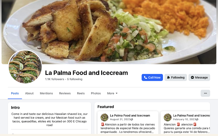
Before the redesign, La Palma’s visual identity consisted of a mix of social media posts, and signage, logo created at different times without a consistent system. While the restaurant had a strong community presence, the branding did not fully reflect the warmth, authenticity, and cultural pride that defines the business.
Existing materials included a logo with inconsistent usage, limited color structure, and no clear typography or layout guidelines. Because of this, menus, advertisements, and online posts often looked unrelated to each other, making it difficult to build strong brand recognition.
This project began by analyzing the current assets in order to identify what should be preserved, what should be refined, and what needed to be redesigned to create a cohesive identity.
Mission/Ethos
La Palma’s mission is to provide fresh authentic Mexican cuisine and ice cream to share the flavors of our homeland. We are an immigrant owned business and we are proud of our roots and share an experience with the Sturgis community.
Design Goal
Develop a culturally respectful, flexible brand identity that balances authenticity with approachability, allowing the restaurant to grow its presence while staying true to its immigrant roots.
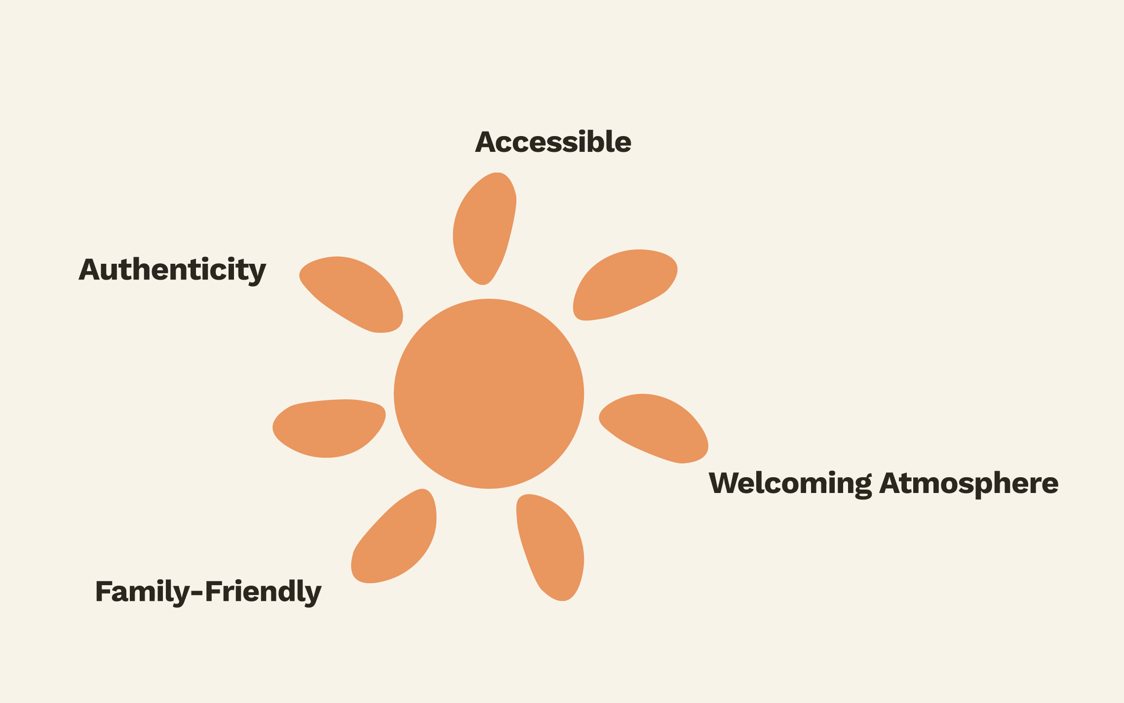
Authenticity – Colors, typography, and patterns reference Mexican visual culture without relying on stereotypes.
Accessibility – The palette and typography were built with readability and contrast in mind to ensure usability across menus, signage, and digital media.
Welcoming atmosphere – Rounded shapes, warm colors, and playful assets support the family-friendly personality of the restaurant.
Community & family – The branding emphasizes connection, tradition, and shared meals as the heart of the experience.
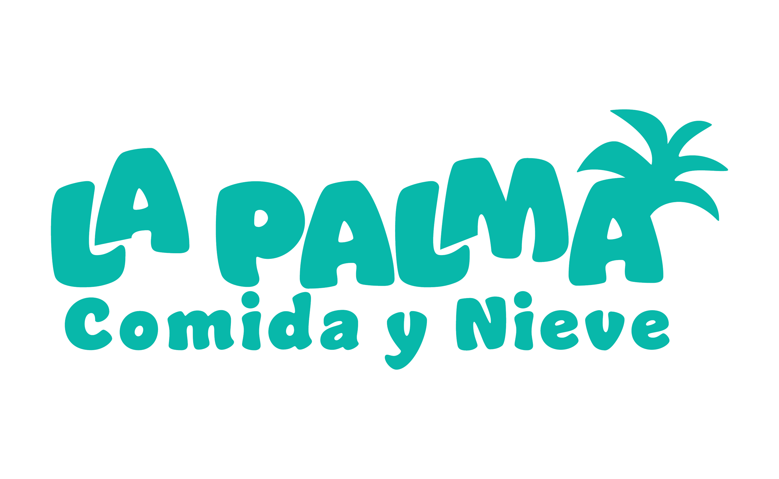
Logo

Color Palette
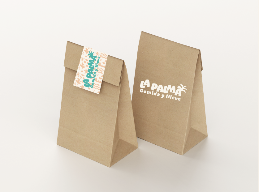
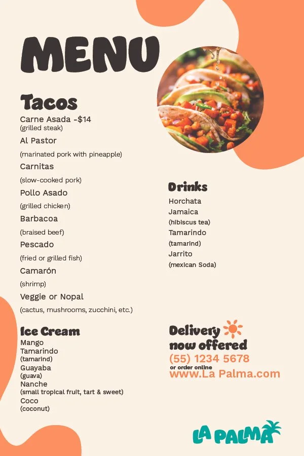
Brand in context