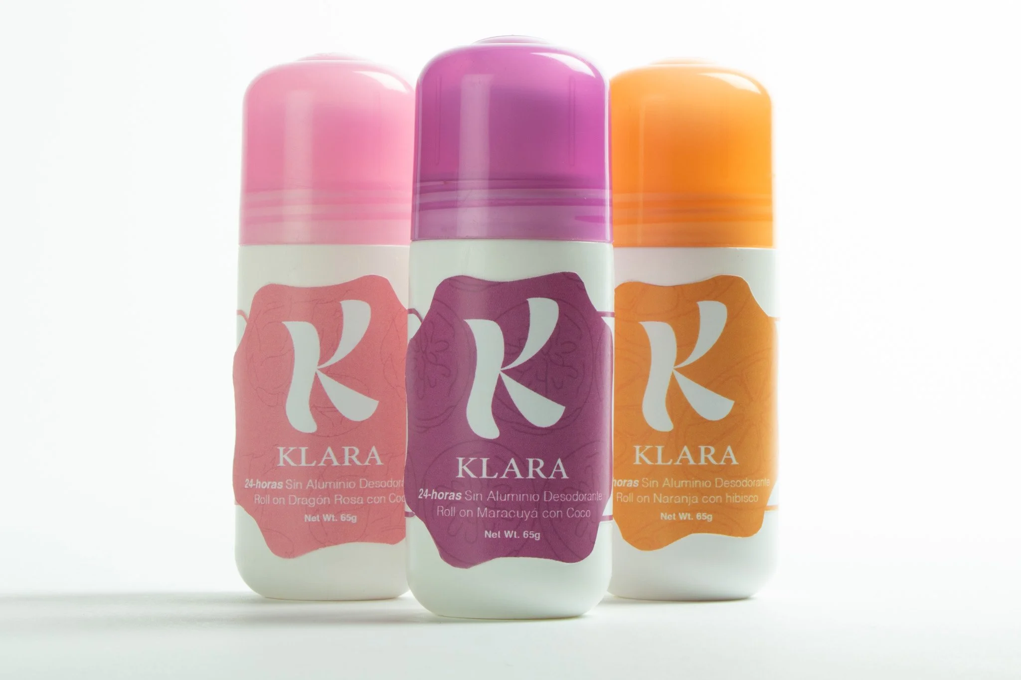
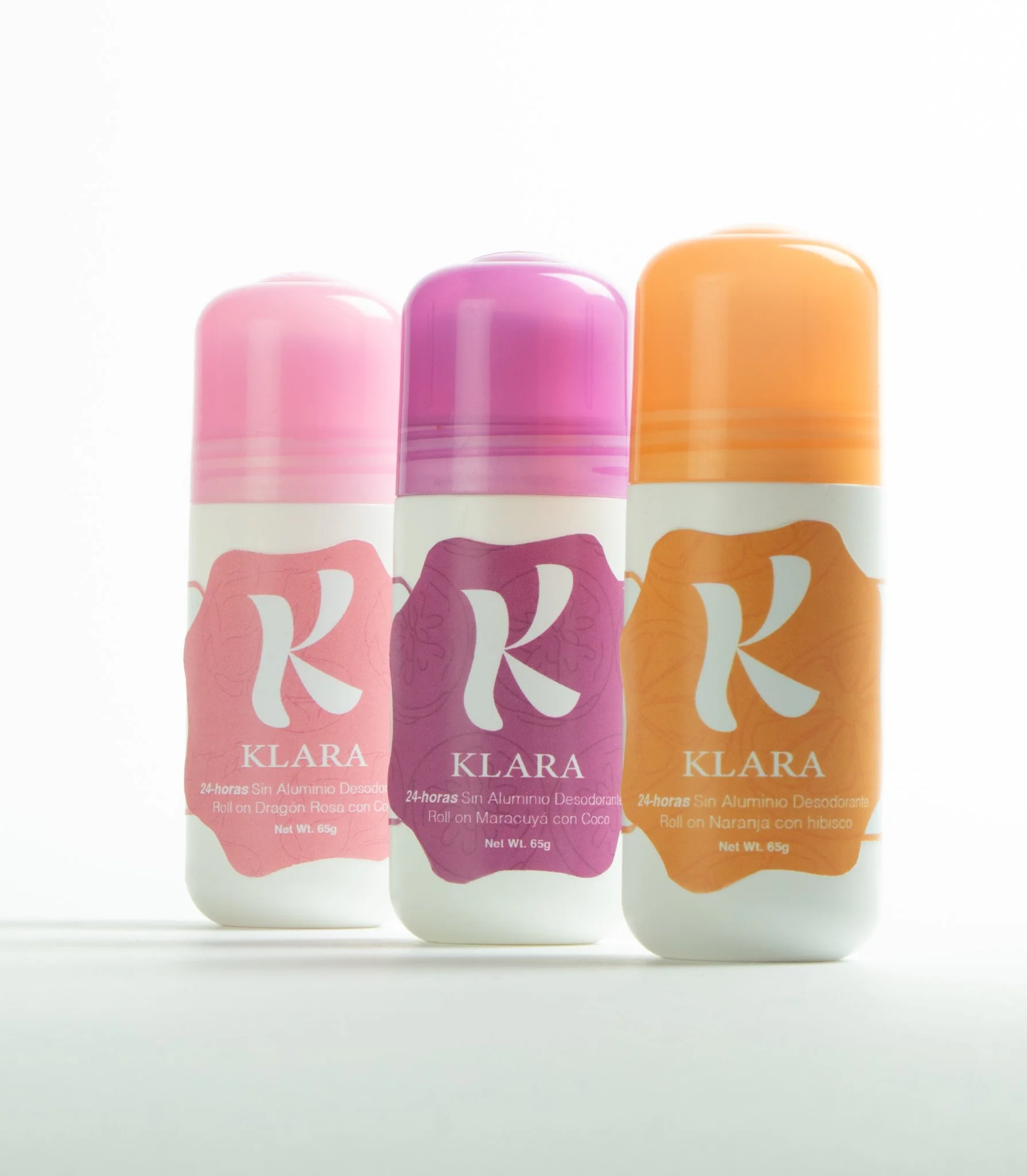
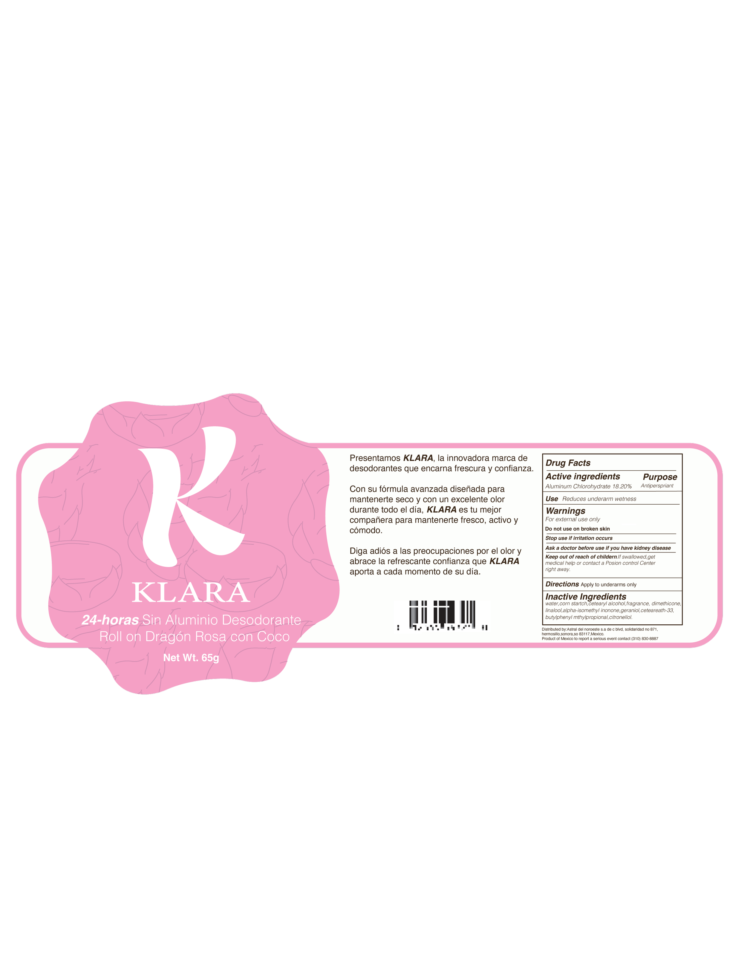
BO is not COOL!
A culturally responsive deodorant brand designed for preteen girls, blending playful form, ergonomic design, and Spanish-first communication.
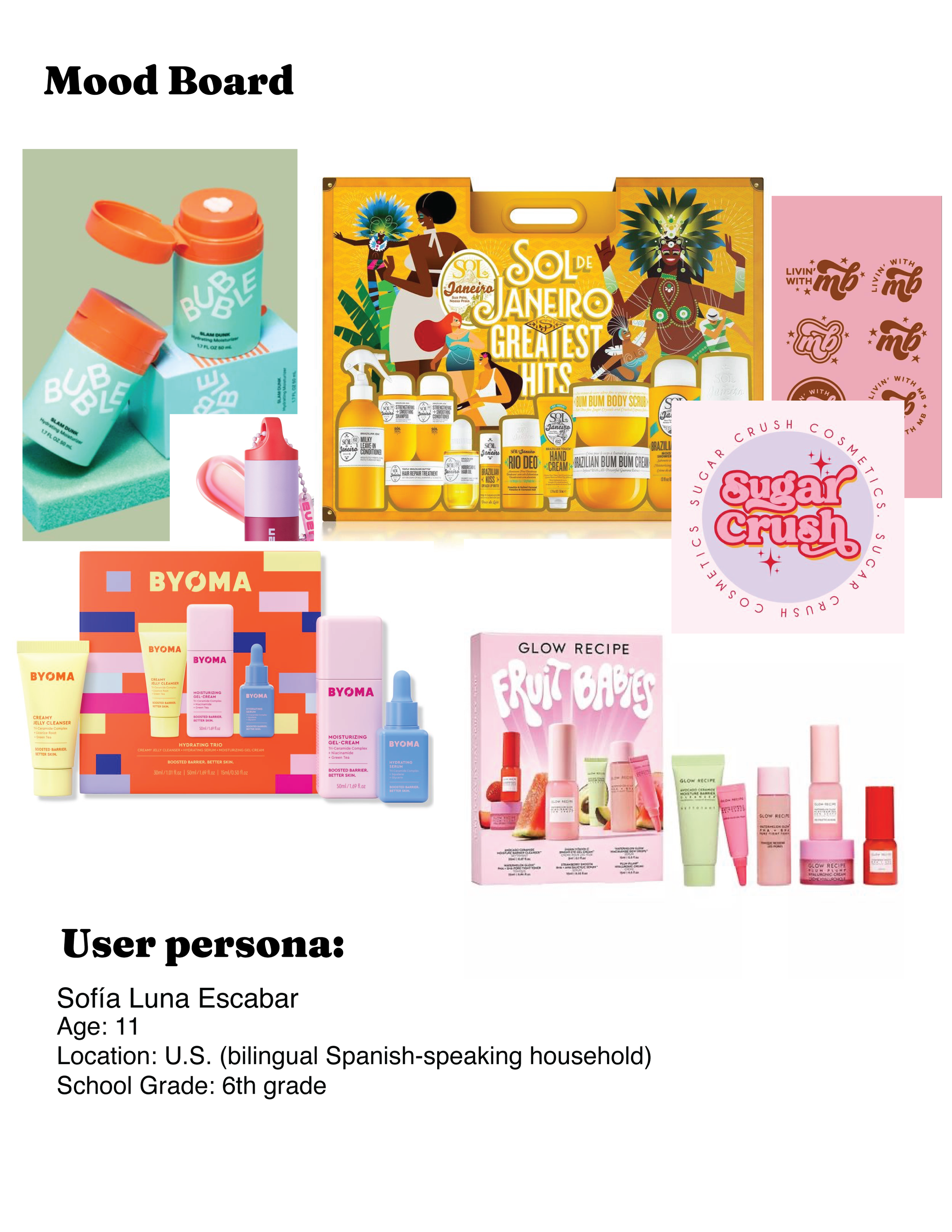
This project was created for Graphic Design 3D Experience (ART 313) and responds to the rise of the 2023 “Sephora kids” trend, where younger audiences are increasingly engaging with beauty and self-care products.
What’s the problem?
Most deodorants aimed at young users feel overly adult, intimidating, or culturally disconnected. There is also a lack of Spanish-forward packaging that speaks directly to bilingual and Hispanic households.
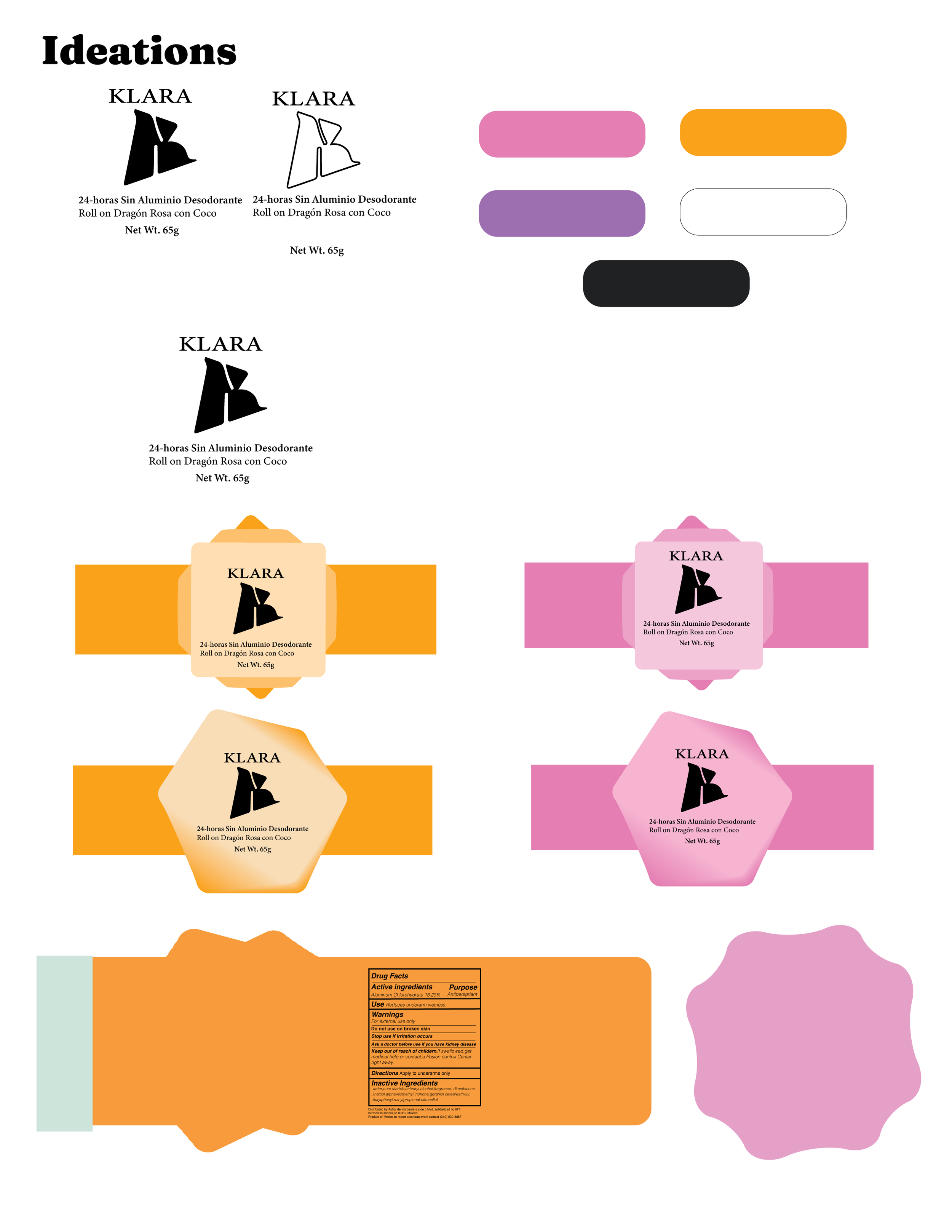
Concept & Approach
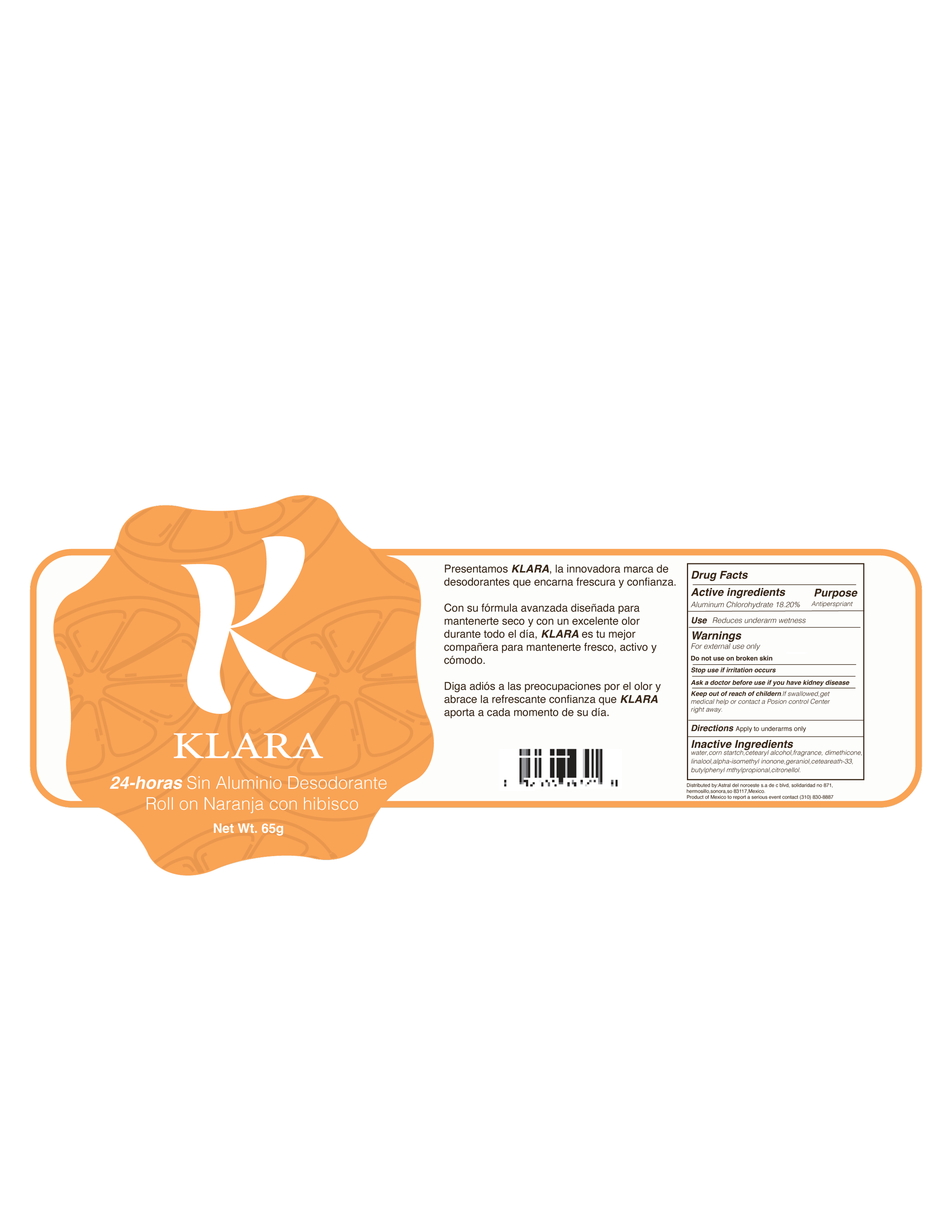
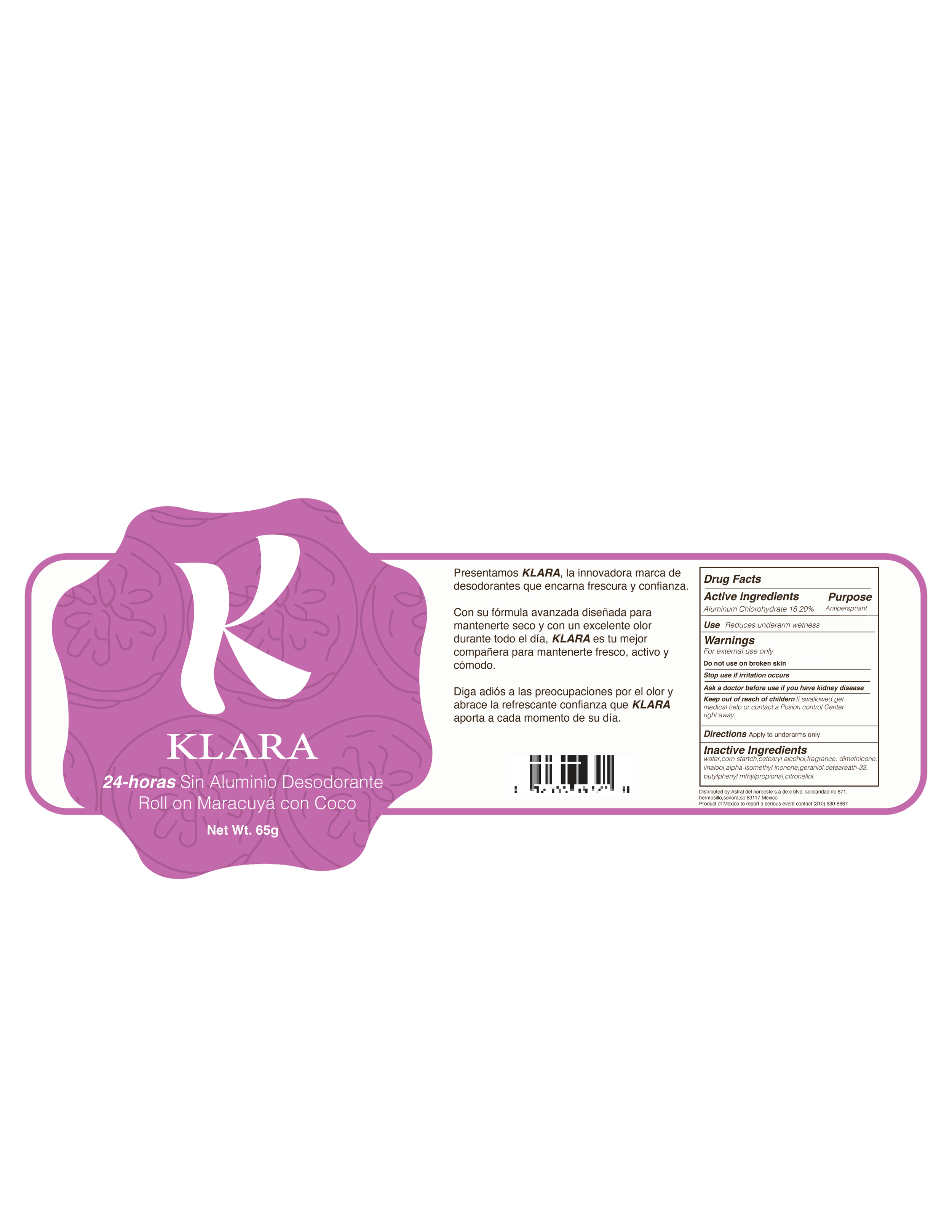
Execution
Primary colors
Blanca
Pantone- 11-4101 TCX
CMYK-C=0%, M=0%, Y=2%,K=3%
HEX- #F7F6F2
Secondary colors
Naranja
Pantone-15-1237 TCX
CMYK-C=0%, M=32%, Y=57%, K=13%
HEX- #DD975F
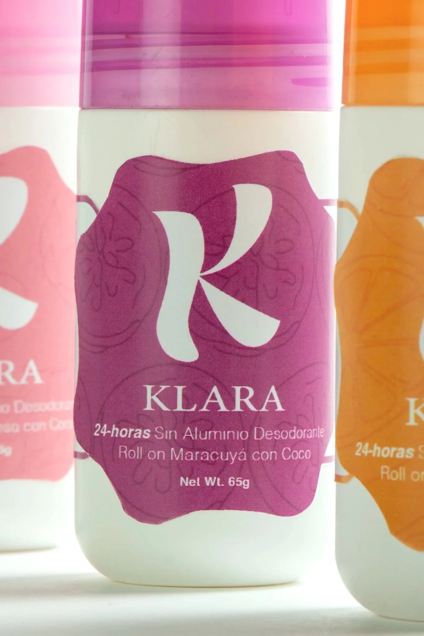
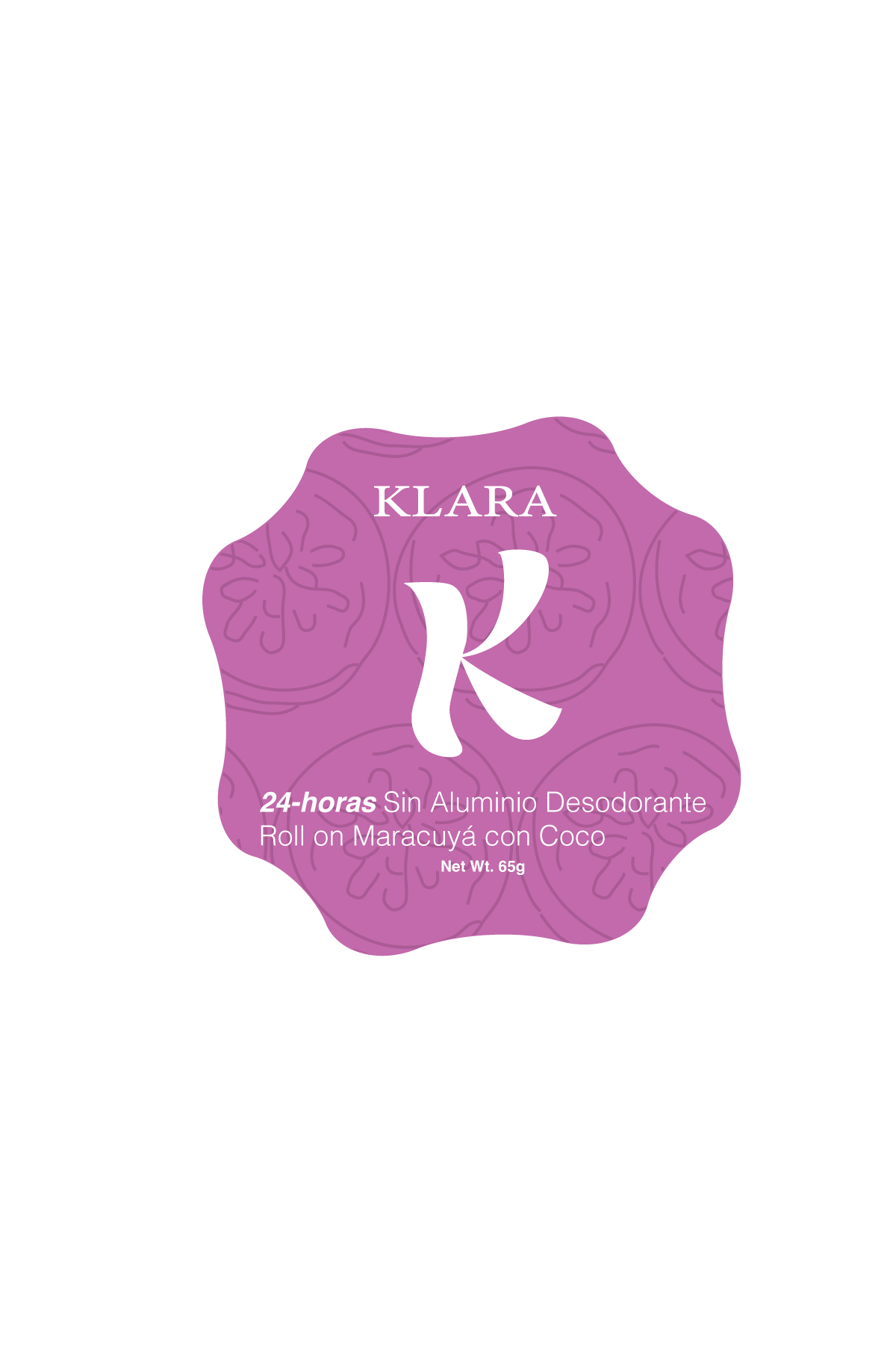
Passion Fruit
Pantone-17-3320 TCX
CMYK-C: 0% , M: 39%, Y: 6%, K: 37%
HEX- #A16398
Dragon Rosa
Pantone-14-3209 TCX
CMYK-C: 0%, M: 28%, Y: 13%, K: 16%
HEX- #D69ABB
Tertiary colors
Coco
Pantone-19-3911 TCX
CMYK-C: 0%, M: 17%, Y: 12%, K: 84%
HEX- #2A2325
Peel
Pantone-19-4008 TCX
CMYK-C: 0%, M: 12%, Y: 35%, K: 83%
HEX- #2B261C
Dragon
Pantone-19-1018 TCX
CMYK-C: 0%, M: 21%, Y: 10%, K: 80%
HEX-#46353E
Helvetica
ABCDEFGHIJKLMNOPQRSTUVWXYZ0123456789 ¿ ? ¡ ! & @ ‘ ’ “ ” « » % * ^ # $ £ € ¢ / ( ) [ ] { } . , ® ©Typography System
Minion Variable Concept
ABCDEFGHIJKLMNOPQRSTUVWXYZ0123456789 ¿ ? ¡ ! & @ ‘ ’ “ ” « » % * ^ # $ £ € ¢ / ( ) [ ] { } . , ® ©Final Print
Outcome